
Centers for Medicare & Medicaid Services
Establishing a flexible, CSS-synced, 4 product Figma library

Role
Senior UX Designer
Timeline
01/24 - 06/24
Background
Our client, CMS, approved a migration from Sketch to Figma as the primary web design tool. As the sole designer on the design system team, I was responsible for establishing the reusable design system Figma library for use across federal healthcare products while working closely with product, engineering, and stakeholders to provide scalable and consistent resources.
Deliverables
Global Figma library with 4 product-themed modes
Documentation site IA redesign
Pattern library
CSS tokenization improvements
A11y components
“There's a bit of divergence because of us banging our heads against Sketch.”
— Anna, Medicare team
Discovering user needs
During discovery for the Sketch to Figma migration, I interviewed 10 designers and 8 developers from Medicare, HealthCare, and CMS product teams and compiled an affinity map identifying existing use of Sketch resources, common challenges, and pain points.
Findings
1
Resources were inflexible and siloed by product.
2
The design to dev handoff left teams frustrated.
3
Component use was unclear and inconsistent.
Solutions
Finding 1: Resources were inflexible and siloed by product.
Solution
One central library with 4 brand themes and components with flexible properties.
One source of truth
There is only one instance of each component with 4 product versions available, aligning teams across products with one library and allowing efficient internal management.
Product modes for all
By establishing the library as one set of components utilizing multiple product modes, we were inherently able to add the CMS brand to the library, which had not previously been provided in Sketch.
Transparency across teams
The component library source file features every component shown in all 4 product themes, allowing for easy comparison of brand styles as well as notation of specific anomalies.
Flexible properties
Through an iterative approach based on designer feedback, I built intuitive variants and properties that accommodate many use cases, with a resulting 100% of my test group (10 designers) expressing satisfaction and ease of use for the end result.
Finding 2: The design to dev handoff left teams frustrated.
Solution
Streamlined token structures synced with Figma variables, as well as supportive guides.
CSS-synced variables
CSS variable changes to increase consistency and facilitate bi-directional syncing between our codebase and the Figma design library.
Streamlined token structure
Changes included standardizing styles, removal of unused variables or variables specific to individual products, and adjustments to better comply with WCAG AA contrast values.
Standardized annotations
I created Figma A11y components with use guidance for marking focus order, html, and screen reader annotations.
Token translation guides
I made scannable charts to translate responsive sizing for designers and developers to reference, in response to confusion over relative sizing, pixel values, and corresponding tokens.
Finding 3: Component use was unclear and inconsistent.
Solution
Clarified guidance and more component patterns.
IA and content clarity
IA was structured to have general, plain language content at the top and more jargon and technical language further into the page. I adjusted heading content to be simple, clear, and concise, avoiding ambiguous language.
Expanded patterns library
We also utilized the migration as an opportunity to add to the available patterns, starting with utility actions, form and error validation patterns, and common page templates.
Initial reception to the Figma launch
“I have to say though, if Figma's DS library is this organized, this will help us align with the Design System a lot better.”
— Anna, Medicare team
-
![]()
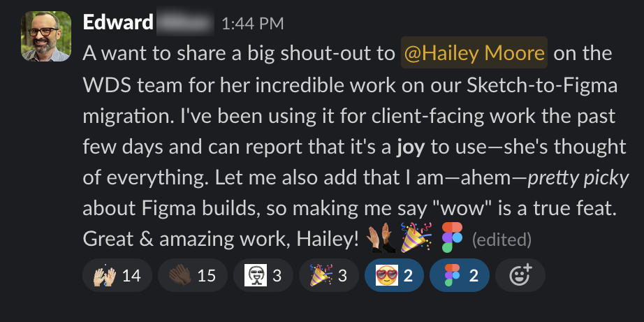
“I...can report that it's a joy to use-she's thought of everything. Let me also add that I am-ahem-pretty picky about Figma builds, so making me say "wow" is a true feat...amazing work, Hailev!”
Ed, HealthCare
-
![]()
"tbh I'm enjoying seeing how close I can get without having to detach any library instances. It's a bit unreal how good it is!"
Kendra, HealthCare
-
![]()
“I would love to know how you figured out how to build all this. is there a tutorial I can follow somewhere? amazing!! 🤯"
Trevin, HealthCare
-
![]()
“I want to particularly shout out Hailey's leadership skills as the sole designer on this crew. Thank you all to your dedication to completing this migration with such professionalism and attention to detail.
Jaci, CMS UX Lead
-
![]()
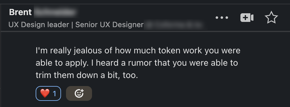
“I'm really jealous of how much token work you were able to apply. I heard a rumor that you were able to trim them down a bit, too."
Brent, Medicare


Key wins
Established improved design resources through Figma, increasing overall product team use of provided resources by more than 25%.
100% satisfaction rate from designers in initial test group.
Added an entire product library for the CSS brand style.
Streamlined and improved CSS token hierarchy. Improved parity from design to development through CSS tokenization and synced resources.
Adjusted guidance for better comprehension and use of resources, including a redesign of component page content and IA.
I provided ongoing leadership and support to designers and product teams also migrating, leading group lessons in utilizing the new design system components, increasing product team trust, and supporting designers with individual Figma coaching and feedback.
“I got a closer look at Hailey’s work on the high-stakes Figma migration, which she fully handled by building the entire library. I’ve done this type of work many times myself, so I reviewed her output with particular scrutiny—it was exemplary. Hailey is also a great teammate and collaborator, and she’s quick to respond to and remediate any issues.”
— Ed, Managing Principal Designer
Retrospective
While product teams were initially cautious to migrate from Sketch, the first Figma library release has reassured worried product teams. Component variants are intuitive, responsive, and flexible, even for teams less familiar with Figma.
Variations across products are easy to compare, both internally through variable modes and externally in the public global file. Finally, the design to development handoff has more clarity, with responsive sizing translation charts and improved CSS tokens directly synced with design components through variables.
Next